


Señales de baño: el diseño se mide en los detalles
The best interior design isn’t defined only by furniture, lighting, or color palettes. It lives in the quiet details that hold a space together. Toilet signs belong to this family of “invisible” elements: rarely the hero, always part of the experience. A generic sign can break the atmosphere you crafted; a carefully designed one becomes a seamless piece of your visual language.

Function and Perception: Beyond Utility
A toilet sign is never neutral. It guides people, of course, but it also signals order, hospitality, and professionalism. In a premium hotel, a makeshift sign undermines the care expressed in reception and rooms. In a restaurant, a cheap sticker distracts from the ambience. In offices, inconsistent signage suggests disorder. When the sign is designed with intent, it reinforces the narrative from the front desk to the farthest corridor.

The Value of Design
A well-designed toilet sign doesn’t happen by accident. It’s an equilibrium of proportion, material, color, and legibility, refined until it feels inevitable. Low-cost, generic solutions reduce the sign to bare necessity—often with awkward silhouettes, poor finishes, and visual noise. They “work,” but at a cost: they pull down the perceived quality of the whole environment.
By contrast, a purpose-designed pictogram is calibrated to your architecture. Lines, curves, and negative space are tuned for instant recognition from a distance and quiet elegance up close. The result is a sign that does more than point the way—it belongs.

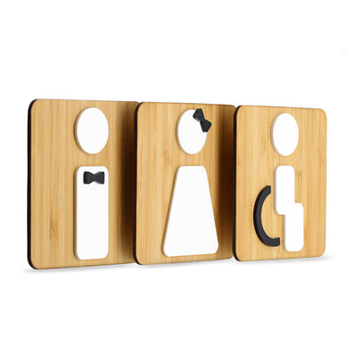
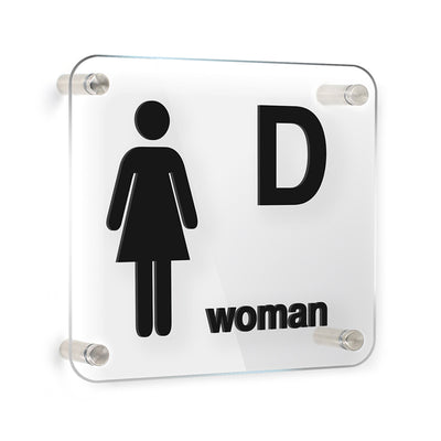
An Inclusive Visual Language
Contemporary wayfinding speaks to everyone. Beyond classic male and female icons, inclusive systems often include unisex, accessibility, shower, and baby-changing symbols. When these icons share the same design grammar—stroke weight, rhythm of shapes, and finishes—they read as a family: coherent, respectful, and universally understandable.
- Unisex: one clear icon reduces doubt and queues.
- Accessibility: clarity at a glance helps users plan routes with confidence.
- Baby changing & showers: small amenities are easier to find when icon families are consistent.
Real-World Applications: Where Detail Makes the Difference
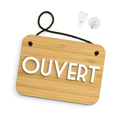
Boutique hotels. Carry the material palette from rooms to corridors. If you use warm timber and soft brass, let the sign echo it—subtle, tactile, and dignified.
Fine dining restaurants. Choose finishes that resonate with tableware and lighting—matte blacks, brushed metals, or refined acrylics—to keep service areas visually quiet and on-brand.
Modern offices. Consistency across floors reduces friction. Clear placement and legibility standards create ease for staff and visitors alike.
Private homes. In a guest bathroom, a discreet, beautifully finished sign can be both practical and a charming conversation piece.

Conclusion
A toilet sign might be small, but it speaks volumes. When it is thoughtfully designed—aligned with your materials, lighting, and brand—it elevates the entire environment. Hotels, restaurants, offices, and homes all benefit from signage that goes beyond utility to deliver a coherent, elegant experience.
Explore SIGNS.style to choose materials, finishes, and icons that turn a functional need into a signature detail for your space.